mirror of
https://github.com/block/buzz.git
synced 2026-08-18 06:50:31 +02:00
 klopez4212andGitHub
857e63c4dd
klopez4212andGitHub
857e63c4dd
## Summary

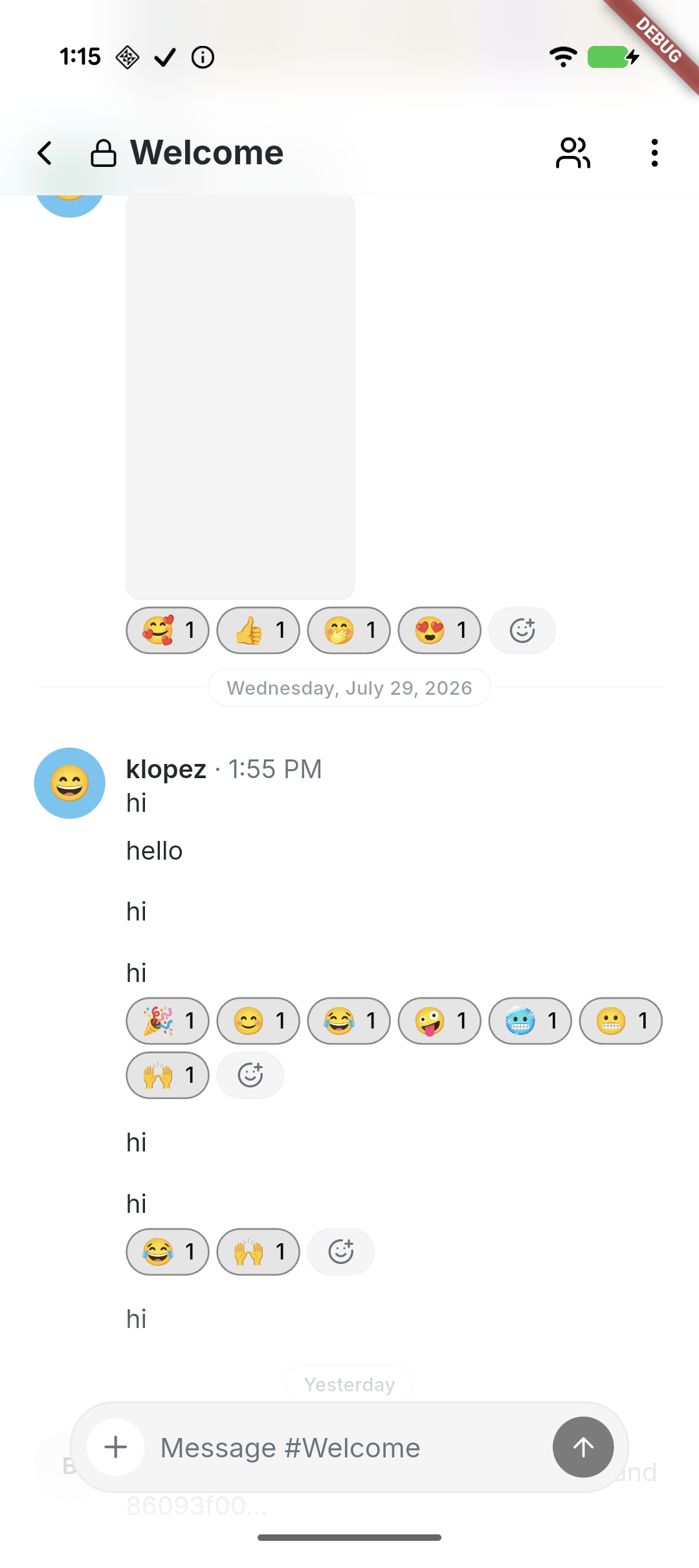
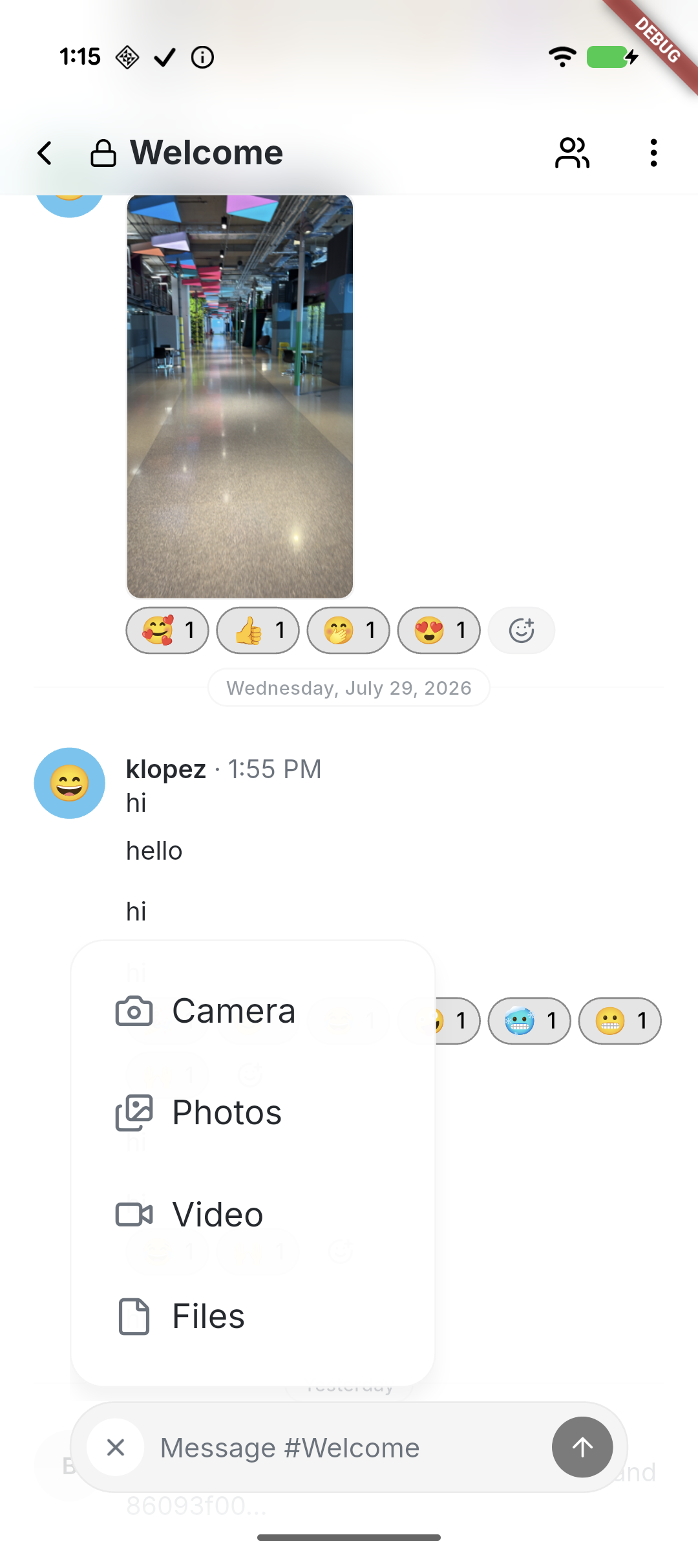
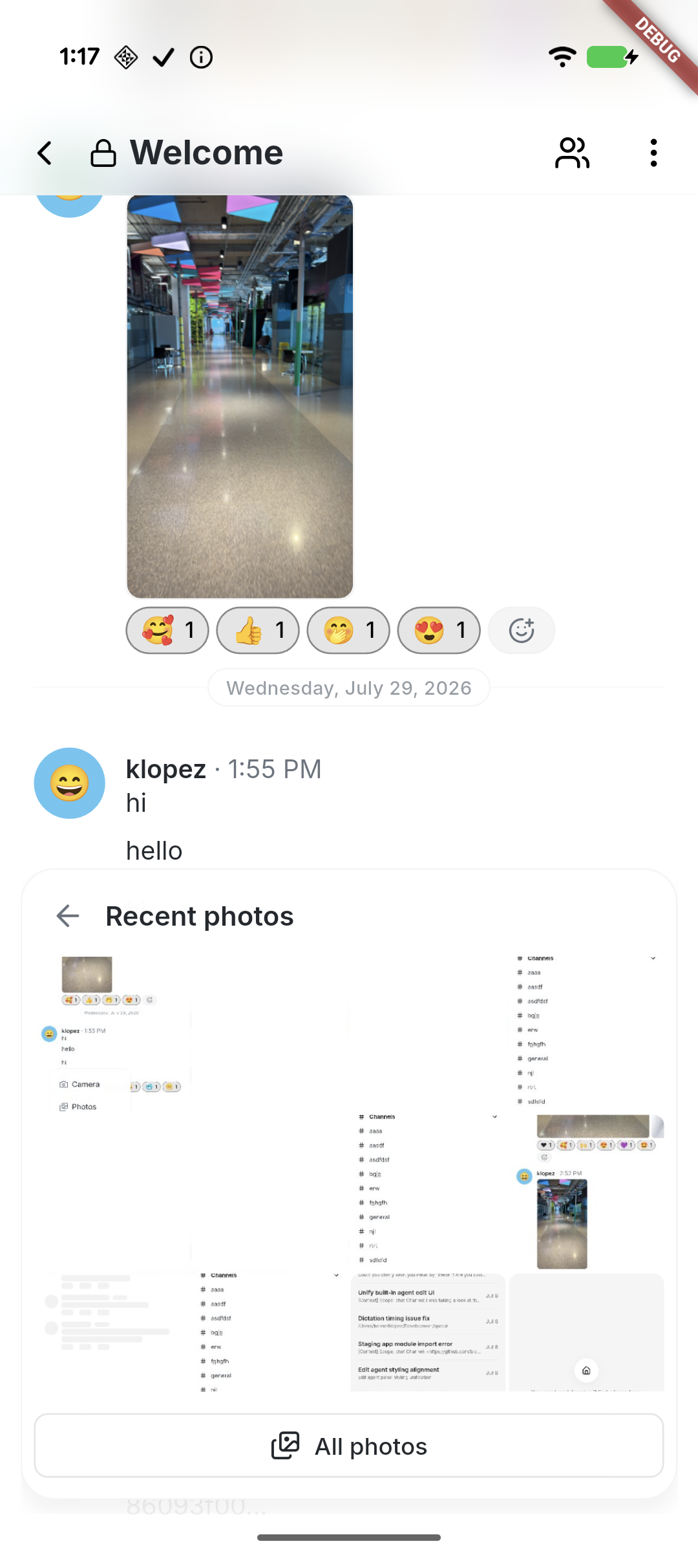
- Refine the mobile composer with compact and expanded states, shared
footer fades, haptics, reliable keyboard dismissal, and full-width
camera and photo surfaces.
- Standardize popovers, filters, and section menus with consistent type,
strokes, radii, spacing, icons, and destructive styling.
- Align message presentation with desktop through consistent system
rows, typing and loading feedback, emoji placement, and predictable
photo viewing.

## Validation

- `just mobile-check`
- `just mobile-test` — 1,037 passed, 1 skipped
- Tested on Pixel 10 and a connected iPhone

## Snapshots

<table>
  <tr>
    <td align="center">Compact composer</td>
    <td align="center">Attachment menu</td>
    <td align="center">Recent photos</td>
  </tr>
  <tr>
<td><img
src="https://raw.githubusercontent.com/block/buzz/9732022cb13bb39ce797c4faaa714fe4c924955f/pr-3918--01-compact-composer.png"
width="260" /></td>
<td><img
src="https://raw.githubusercontent.com/block/buzz/9732022cb13bb39ce797c4faaa714fe4c924955f/pr-3918--02-attachment-menu.png"
width="260" /></td>
<td><img
src="https://raw.githubusercontent.com/block/buzz/9732022cb13bb39ce797c4faaa714fe4c924955f/pr-3918--03-photo-surface.png"
width="260" /></td>
  </tr>
</table>

---------

Signed-off-by: kenny lopez <klopez4212@gmail.com>
340 lines
12 KiB
Dart
340 lines
12 KiB
Dart
import 'package:flutter/material.dart';
|
|
import 'package:flutter/services.dart';
|
|
|
|
import 'app_colors.dart';
|
|
import 'color_scheme.dart';
|
|
import 'grid.dart';
|
|
import 'text_theme.dart';
|
|
|
|
/// Border radius constants matching desktop shadcn "New York" style.
|
|
/// Desktop uses --radius: 0.625rem (10px) as base:
|
|
/// lg = 10px, md = 8px, sm = 6px
|
|
class Radii {
|
|
/// Small radius for compact UI elements.
|
|
static const double xs = 4.0;
|
|
static const double lg = 10.0;
|
|
static const double md = 8.0;
|
|
static const double sm = 6.0;
|
|
static const double card = 12.0; // grouped settings cards
|
|
static const double popover = 20.0;
|
|
static const double dialog = 24.0; // desktop uses rounded-3xl for dialogs
|
|
|
|
/// Fully rounds pills, circles, and other capsule shapes.
|
|
static const double full = 999.0;
|
|
}
|
|
|
|
class AppTheme {
|
|
static ThemeData light({
|
|
ColorScheme? colorScheme,
|
|
Gradient? topSectionGradient,
|
|
}) {
|
|
final scheme = colorScheme ?? lightColorScheme;
|
|
final appColors = AppColors(
|
|
success: const Color(0xFF40A02B), // Catppuccin Latte Green — universal
|
|
warning: const Color(0xFFDF8E1D), // Latte Yellow
|
|
accent: scheme.tertiary,
|
|
topSectionGradient: topSectionGradient,
|
|
);
|
|
|
|
return _buildTheme(
|
|
scheme: scheme,
|
|
appColors: appColors,
|
|
brightness: Brightness.light,
|
|
statusBarIconBrightness: Brightness.dark,
|
|
statusBarBrightness: Brightness.light,
|
|
);
|
|
}
|
|
|
|
static ThemeData dark({
|
|
ColorScheme? colorScheme,
|
|
Gradient? topSectionGradient,
|
|
}) {
|
|
final scheme = colorScheme ?? darkColorScheme;
|
|
final appColors = AppColors(
|
|
success: const Color(
|
|
0xFFA6DA95,
|
|
), // Catppuccin Macchiato Green — universal
|
|
warning: const Color(0xFFEED49F), // Macchiato Yellow
|
|
accent: scheme.tertiary,
|
|
topSectionGradient: topSectionGradient,
|
|
);
|
|
|
|
return _buildTheme(
|
|
scheme: scheme,
|
|
appColors: appColors,
|
|
brightness: Brightness.dark,
|
|
statusBarIconBrightness: Brightness.light,
|
|
statusBarBrightness: Brightness.dark,
|
|
);
|
|
}
|
|
|
|
static ThemeData _buildTheme({
|
|
required ColorScheme scheme,
|
|
required AppColors appColors,
|
|
required Brightness brightness,
|
|
required Brightness statusBarIconBrightness,
|
|
required Brightness statusBarBrightness,
|
|
}) {
|
|
return ThemeData(
|
|
useMaterial3: true,
|
|
colorScheme: scheme,
|
|
splashFactory: NoSplash.splashFactory,
|
|
scaffoldBackgroundColor: scheme.surface,
|
|
extensions: [appColors],
|
|
fontFamily: 'Inter',
|
|
textTheme: textTheme,
|
|
appBarTheme: AppBarTheme(
|
|
backgroundColor: Colors.transparent,
|
|
foregroundColor: scheme.onSurface,
|
|
surfaceTintColor: Colors.transparent,
|
|
elevation: 0,
|
|
scrolledUnderElevation: 0,
|
|
titleTextStyle: textTheme.titleMedium?.copyWith(
|
|
color: scheme.onSurface,
|
|
),
|
|
systemOverlayStyle: SystemUiOverlayStyle(
|
|
statusBarColor: Colors.transparent,
|
|
statusBarIconBrightness: statusBarIconBrightness,
|
|
statusBarBrightness: statusBarBrightness,
|
|
),
|
|
),
|
|
|
|
// Bottom navigation: clean style, no indicator pill
|
|
navigationBarTheme: NavigationBarThemeData(
|
|
backgroundColor: scheme.surface,
|
|
elevation: 0,
|
|
indicatorColor: Colors.transparent,
|
|
iconTheme: WidgetStateProperty.resolveWith((states) {
|
|
if (states.contains(WidgetState.selected)) {
|
|
return IconThemeData(color: scheme.primary, size: 24);
|
|
}
|
|
return IconThemeData(color: scheme.onSurfaceVariant, size: 24);
|
|
}),
|
|
labelTextStyle: WidgetStateProperty.resolveWith((states) {
|
|
if (states.contains(WidgetState.selected)) {
|
|
return textTheme.labelSmall?.copyWith(
|
|
color: scheme.primary,
|
|
fontWeight: FontWeight.w600,
|
|
);
|
|
}
|
|
return textTheme.labelSmall?.copyWith(color: scheme.onSurfaceVariant);
|
|
}),
|
|
),
|
|
|
|
// Buttons: desktop uses rounded-md (8px), h-9 (36px), px-4 (16px)
|
|
elevatedButtonTheme: ElevatedButtonThemeData(
|
|
style: ElevatedButton.styleFrom(
|
|
backgroundColor: scheme.primary,
|
|
foregroundColor: scheme.onPrimary,
|
|
elevation: 0,
|
|
padding: const EdgeInsets.symmetric(horizontal: 16, vertical: 10),
|
|
minimumSize: const Size(0, 36),
|
|
shape: RoundedRectangleBorder(
|
|
borderRadius: BorderRadius.circular(Radii.md),
|
|
),
|
|
textStyle: textTheme.labelMedium?.copyWith(
|
|
fontWeight: FontWeight.w500,
|
|
),
|
|
),
|
|
),
|
|
filledButtonTheme: FilledButtonThemeData(
|
|
style: FilledButton.styleFrom(
|
|
elevation: 0,
|
|
padding: const EdgeInsets.symmetric(horizontal: 16, vertical: 10),
|
|
minimumSize: const Size(0, 36),
|
|
shape: RoundedRectangleBorder(
|
|
borderRadius: BorderRadius.circular(Radii.md),
|
|
),
|
|
textStyle: textTheme.labelMedium?.copyWith(
|
|
fontWeight: FontWeight.w500,
|
|
),
|
|
),
|
|
),
|
|
outlinedButtonTheme: OutlinedButtonThemeData(
|
|
style: OutlinedButton.styleFrom(
|
|
backgroundColor: scheme.surface,
|
|
foregroundColor: scheme.onSurface,
|
|
side: BorderSide(color: scheme.outline, width: 1),
|
|
padding: const EdgeInsets.symmetric(horizontal: 16, vertical: 10),
|
|
minimumSize: const Size(0, 36),
|
|
shape: RoundedRectangleBorder(
|
|
borderRadius: BorderRadius.circular(Radii.md),
|
|
),
|
|
textStyle: textTheme.labelMedium?.copyWith(
|
|
fontWeight: FontWeight.w500,
|
|
),
|
|
),
|
|
),
|
|
textButtonTheme: TextButtonThemeData(
|
|
style: TextButton.styleFrom(
|
|
foregroundColor: scheme.onSurface,
|
|
padding: const EdgeInsets.symmetric(horizontal: 16, vertical: 8),
|
|
minimumSize: const Size(0, 36),
|
|
shape: RoundedRectangleBorder(
|
|
borderRadius: BorderRadius.circular(Radii.md),
|
|
),
|
|
textStyle: textTheme.labelMedium?.copyWith(
|
|
fontWeight: FontWeight.w500,
|
|
),
|
|
),
|
|
),
|
|
|
|
// Cards: desktop uses rounded-lg (10px), flat, no elevation
|
|
cardTheme: CardThemeData(
|
|
color: scheme.surfaceContainerHighest,
|
|
margin: EdgeInsets.zero,
|
|
elevation: 0,
|
|
shape: RoundedRectangleBorder(
|
|
borderRadius: BorderRadius.circular(Radii.lg),
|
|
),
|
|
),
|
|
|
|
// Inputs: desktop uses outlined style, rounded-md (8px), h-9 (36px)
|
|
inputDecorationTheme: InputDecorationTheme(
|
|
filled: false,
|
|
border: OutlineInputBorder(
|
|
borderRadius: BorderRadius.circular(Radii.md),
|
|
borderSide: BorderSide(color: scheme.outline),
|
|
),
|
|
enabledBorder: OutlineInputBorder(
|
|
borderRadius: BorderRadius.circular(Radii.md),
|
|
borderSide: BorderSide(color: scheme.outline),
|
|
),
|
|
focusedBorder: OutlineInputBorder(
|
|
borderRadius: BorderRadius.circular(Radii.md),
|
|
borderSide: BorderSide(color: scheme.primary),
|
|
),
|
|
errorBorder: OutlineInputBorder(
|
|
borderRadius: BorderRadius.circular(Radii.md),
|
|
borderSide: BorderSide(color: scheme.error),
|
|
),
|
|
focusedErrorBorder: OutlineInputBorder(
|
|
borderRadius: BorderRadius.circular(Radii.md),
|
|
borderSide: BorderSide(color: scheme.error),
|
|
),
|
|
contentPadding: const EdgeInsets.symmetric(
|
|
horizontal: 12,
|
|
vertical: 10,
|
|
),
|
|
isDense: true,
|
|
),
|
|
|
|
// Dialogs: desktop uses rounded-3xl (24px), custom overlay
|
|
dialogTheme: DialogThemeData(
|
|
backgroundColor: scheme.surface,
|
|
elevation: 0,
|
|
shape: RoundedRectangleBorder(
|
|
borderRadius: BorderRadius.circular(Radii.dialog),
|
|
side: BorderSide(color: scheme.outline),
|
|
),
|
|
titleTextStyle: textTheme.titleLarge?.copyWith(
|
|
color: scheme.onSurface,
|
|
fontSize: 18,
|
|
fontWeight: FontWeight.w600,
|
|
letterSpacing: -0.3,
|
|
),
|
|
contentTextStyle: textTheme.bodyMedium?.copyWith(
|
|
color: scheme.onSurfaceVariant,
|
|
),
|
|
),
|
|
|
|
progressIndicatorTheme: ProgressIndicatorThemeData(
|
|
strokeWidth: 2,
|
|
color: scheme.primary,
|
|
circularTrackColor: scheme.onSurfaceVariant.withValues(alpha: 0.2),
|
|
),
|
|
|
|
listTileTheme: ListTileThemeData(
|
|
titleTextStyle: textTheme.titleSmall?.copyWith(color: scheme.onSurface),
|
|
subtitleTextStyle: textTheme.bodyMedium?.copyWith(
|
|
color: scheme.secondary,
|
|
),
|
|
iconColor: scheme.secondary,
|
|
contentPadding: const EdgeInsets.symmetric(horizontal: Grid.twelve),
|
|
minVerticalPadding: Grid.twelve,
|
|
horizontalTitleGap: Grid.twelve,
|
|
shape: RoundedRectangleBorder(
|
|
borderRadius: BorderRadius.circular(Radii.md),
|
|
),
|
|
),
|
|
|
|
// Chips: desktop uses rounded-sm (6px)
|
|
chipTheme: ChipThemeData(
|
|
labelStyle: textTheme.bodySmall?.copyWith(color: scheme.secondary),
|
|
// M3 resolves the chip container via `color` (WidgetStateProperty);
|
|
// `selectedColor` is the legacy M2 path and is ignored here. Selected
|
|
// filter chips (Pulse/Search/Activity tabs) use the accent.
|
|
color: WidgetStateProperty.resolveWith((states) {
|
|
if (states.contains(WidgetState.selected)) return scheme.primary;
|
|
return scheme.surfaceContainerHighest;
|
|
}),
|
|
checkmarkColor: scheme.onPrimary,
|
|
shape: RoundedRectangleBorder(
|
|
side: BorderSide.none,
|
|
borderRadius: BorderRadius.circular(Radii.sm),
|
|
),
|
|
side: BorderSide.none,
|
|
padding: const EdgeInsets.symmetric(horizontal: 8),
|
|
labelPadding: EdgeInsets.zero,
|
|
),
|
|
|
|
// Popups/menus share the elevated 20px mobile popover treatment.
|
|
popupMenuTheme: PopupMenuThemeData(
|
|
color: scheme.surface.withValues(alpha: 0.98),
|
|
elevation: 8,
|
|
shadowColor: scheme.shadow.withValues(alpha: 0.18),
|
|
surfaceTintColor: Colors.transparent,
|
|
textStyle: textTheme.labelLarge?.copyWith(color: scheme.onSurface),
|
|
labelTextStyle: WidgetStatePropertyAll(
|
|
textTheme.labelLarge?.copyWith(color: scheme.onSurface),
|
|
),
|
|
shape: RoundedRectangleBorder(
|
|
borderRadius: BorderRadius.circular(Radii.popover),
|
|
side: BorderSide(
|
|
color: Colors.black.withValues(alpha: 0.04),
|
|
width: 1,
|
|
),
|
|
),
|
|
),
|
|
|
|
// Bottom sheet: match dialog radius
|
|
bottomSheetTheme: BottomSheetThemeData(
|
|
backgroundColor: scheme.surface,
|
|
elevation: 0,
|
|
shape: const RoundedRectangleBorder(
|
|
borderRadius: BorderRadius.vertical(
|
|
top: Radius.circular(Radii.dialog),
|
|
),
|
|
),
|
|
),
|
|
|
|
// Tooltips: desktop uses rounded-md, primary bg
|
|
tooltipTheme: TooltipThemeData(
|
|
decoration: BoxDecoration(
|
|
color: scheme.primary,
|
|
borderRadius: BorderRadius.circular(Radii.md),
|
|
),
|
|
textStyle: textTheme.bodySmall?.copyWith(
|
|
color: scheme.onPrimary,
|
|
fontSize: 12,
|
|
),
|
|
padding: const EdgeInsets.symmetric(horizontal: 12, vertical: 6),
|
|
),
|
|
|
|
dividerTheme: DividerThemeData(
|
|
color: scheme.outline,
|
|
thickness: 1,
|
|
space: 1,
|
|
),
|
|
|
|
// Snackbar
|
|
snackBarTheme: SnackBarThemeData(
|
|
behavior: SnackBarBehavior.floating,
|
|
shape: RoundedRectangleBorder(
|
|
borderRadius: BorderRadius.circular(Radii.md),
|
|
),
|
|
),
|
|
);
|
|
}
|
|
}
|