mirror of
https://github.com/block/buzz.git
synced 2026-08-18 06:50:31 +02:00
 Taylor HoandGitHub
edc4a09aaa
Taylor HoandGitHub
edc4a09aaa
**Category:** improvement **User Impact:** Users can scan what each workflow does and trigger, edit, duplicate, enable, disable, or delete it directly from the library. **Problem:** The workflow list buried common actions and did not expose each automation's trigger-to-action shape at a glance. **Solution:** Add a responsive workflow library with a persistent create tile, compact trigger/action diagrams, prominent workflow titles with supporting descriptions, and shared card actions while preserving existing detail, editor, and run-history entry points. Card toggles refresh both list and open-detail caches so status and definition stay consistent. <details> <summary>File changes</summary> **desktop/src/features/workflows/ui/WorkflowActionsMenu.tsx** Adds a shared card menu for trigger, edit, duplicate, enable/disable, and delete actions. **desktop/src/features/workflows/ui/WorkflowCard.tsx** Reworks cards around the prototype's visual hierarchy: color-coded trigger, action flow, sentence-case eyebrow, prominent title, supporting description, status, channel, and update date without a footer clock icon. **desktop/src/features/workflows/ui/WorkflowsView.tsx** Adds the responsive grid, create tile, mutation wiring, and list/detail cache invalidation. Container breakpoints keep cards two-across at medium widths and three-across in the 1280px desktop layout. **desktop/src/features/workflows/ui/workflowDefinition.ts** Adds immutable enabled-state updates plus narrow trigger and first-action readers used only to select card icons. **desktop/src/features/workflows/ui/workflowDefinition.test.mjs** Covers neutral icon selection, enabled-state immutability, and status presentation. **desktop/tests/e2e/workflows.spec.ts** Covers the create tile, title/description hierarchy, selected-card enable/disable consistency, and deterministic narrow/medium/wide captures while retaining existing action coverage. </details> ## Reproduction steps 1. Open **Workflows** and confirm the create tile stays first as cards flow from one to three columns with available width. 2. Confirm each card shows a sentence-case trigger eyebrow, prominent workflow title, supporting description when present, status, channel, and update date without a clock icon. 3. Open a card's overflow menu and trigger, edit, duplicate, enable/disable, or delete the workflow. 4. Leave the detail panel open while toggling and confirm its badge and JSON definition update with the card. ## Screenshots Real built E2E UI with representative workflow data at three viewport sizes. ### Narrow — 800 × 720 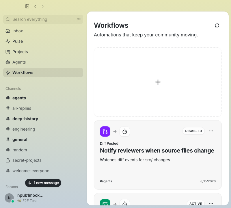 ### Medium — 1024 × 720 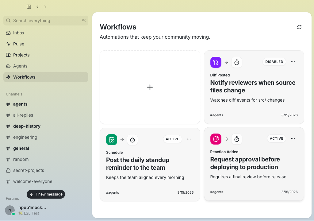 ### Wide — 1280 × 720 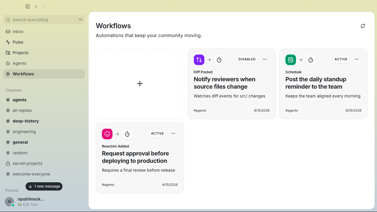 ### Card actions 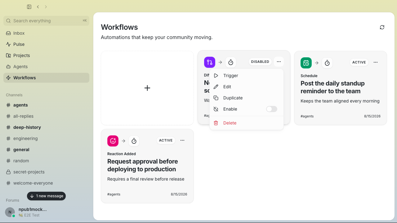 --------- Signed-off-by: Taylor Ho <taylorkmho@gmail.com>




Buzz
Desktop chat shell with:
- Tauri + React + TypeScript + Vite
- Tailwind CSS
- shadcn/ui-ready shared components
- Biome (lint/format/check)
- Feature-driven frontend structure
Scripts
pnpm dev- run the web frontendpnpm tauri dev- run the desktop apppnpm build- typecheck and build frontendpnpm typecheck- TypeScript checkspnpm lint- Biome lintpnpm format- Biome format (write)pnpm check- Biome check
Structure
src/shared- reusable app-wide code (ui,lib,styles)src/features- feature modules (vertical slices)src/app- top-level app composition